
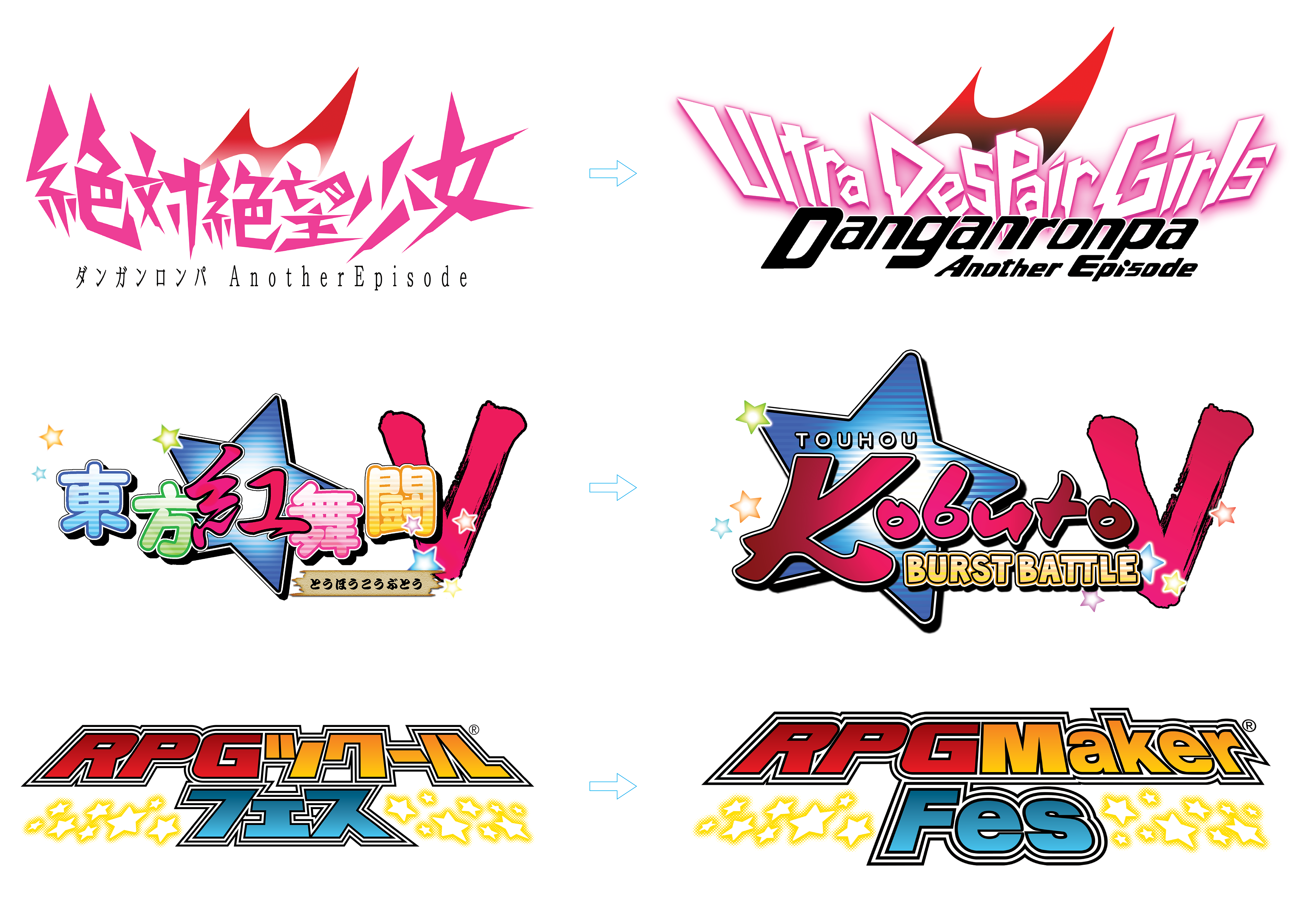
Video Game Logo Localization
This collection highlights logo localization work created for Japanese game releases during my time at NIS America. Each logo required carefully adapting highly stylized Japanese typography into English while maintaining the original composition, energy, and brand recognition of the source material. Because these projects supported official localized releases, the goal was not redesign, but faithful adaptation that respected the intent of the original creators while still functioning effectively for Western audiences.

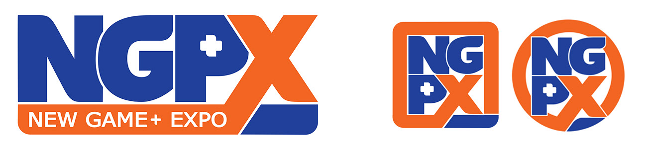
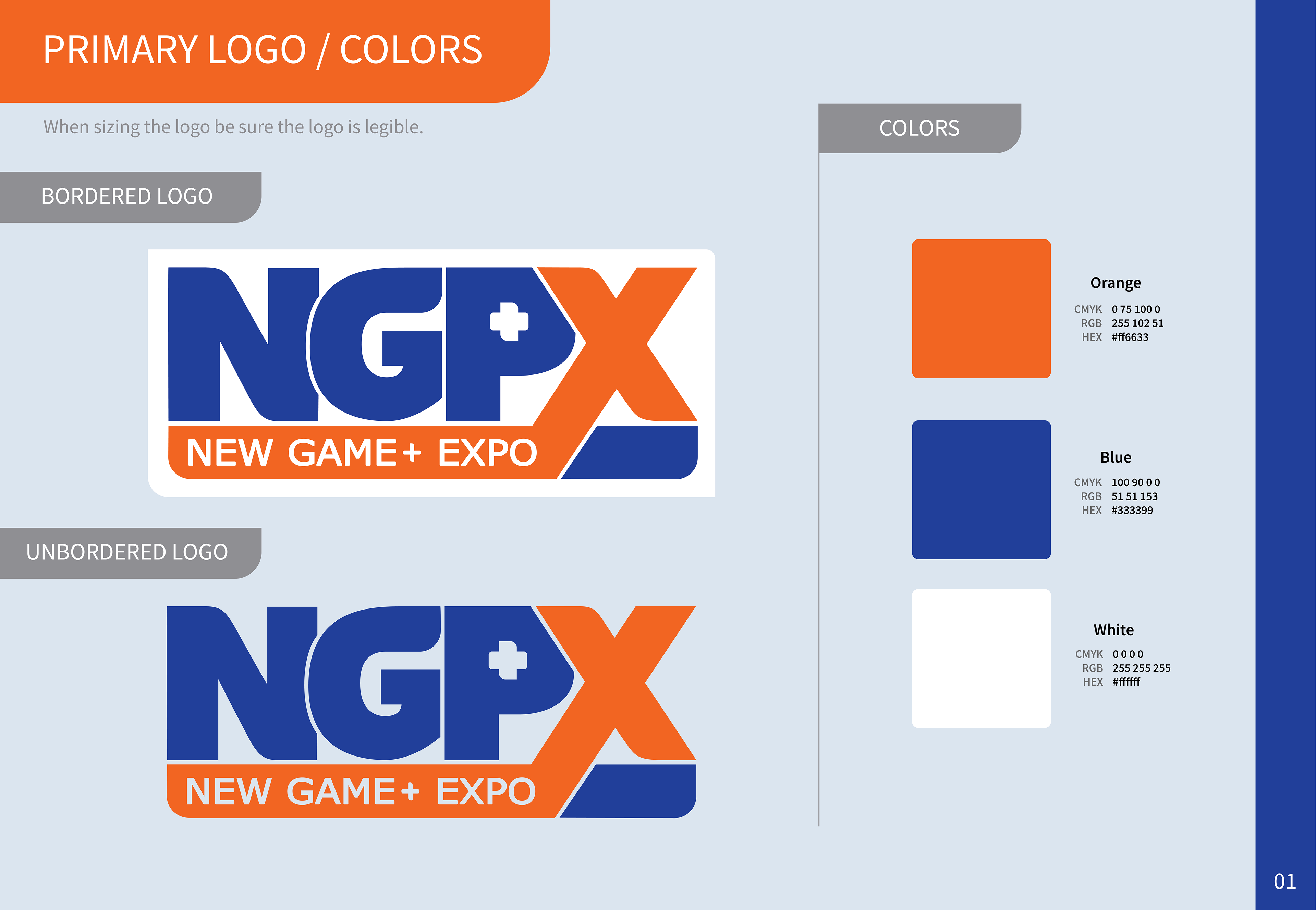
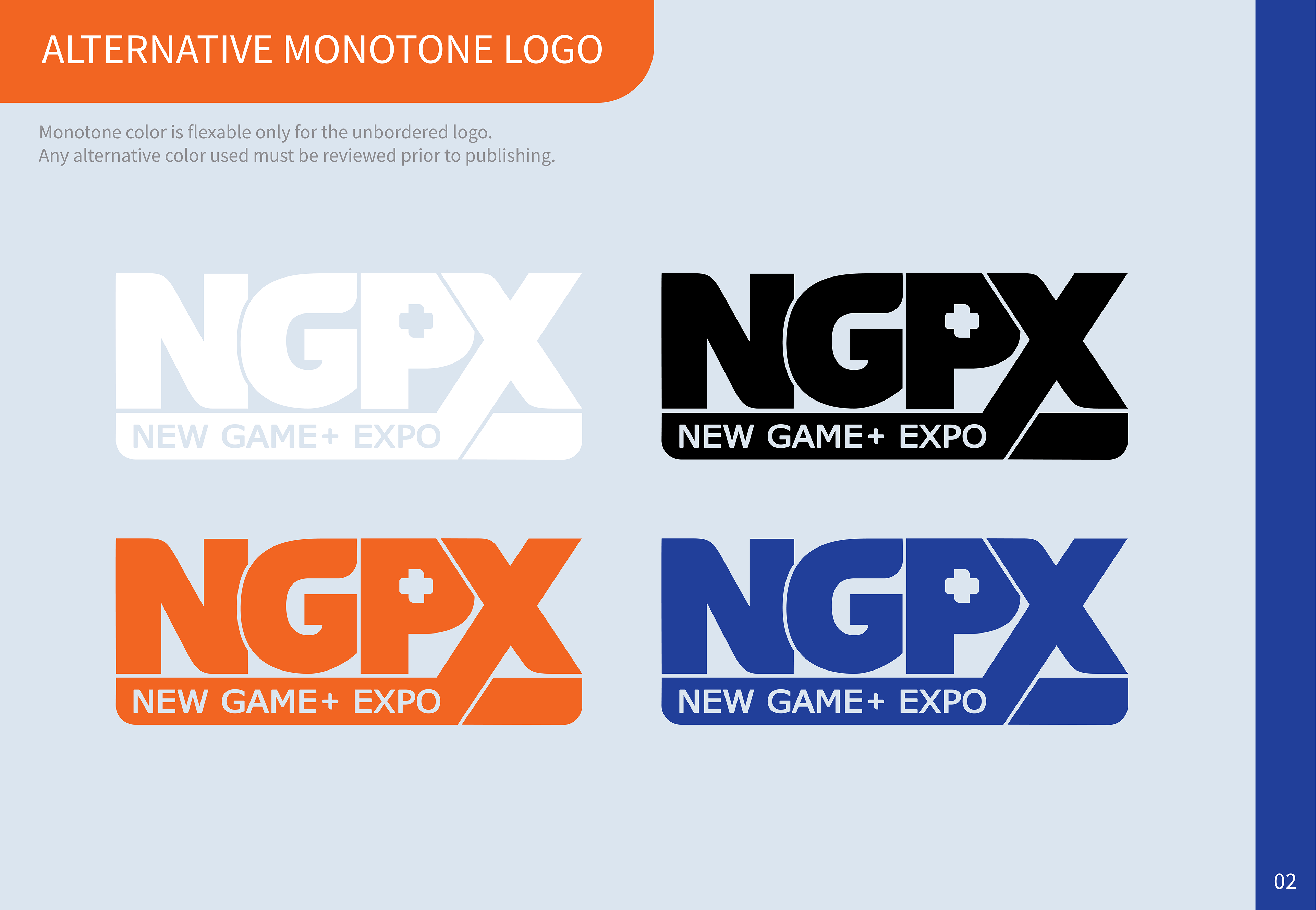
NGPX (New Game+ Expo) Logo & Brand Identity
Art Direction & Event Management
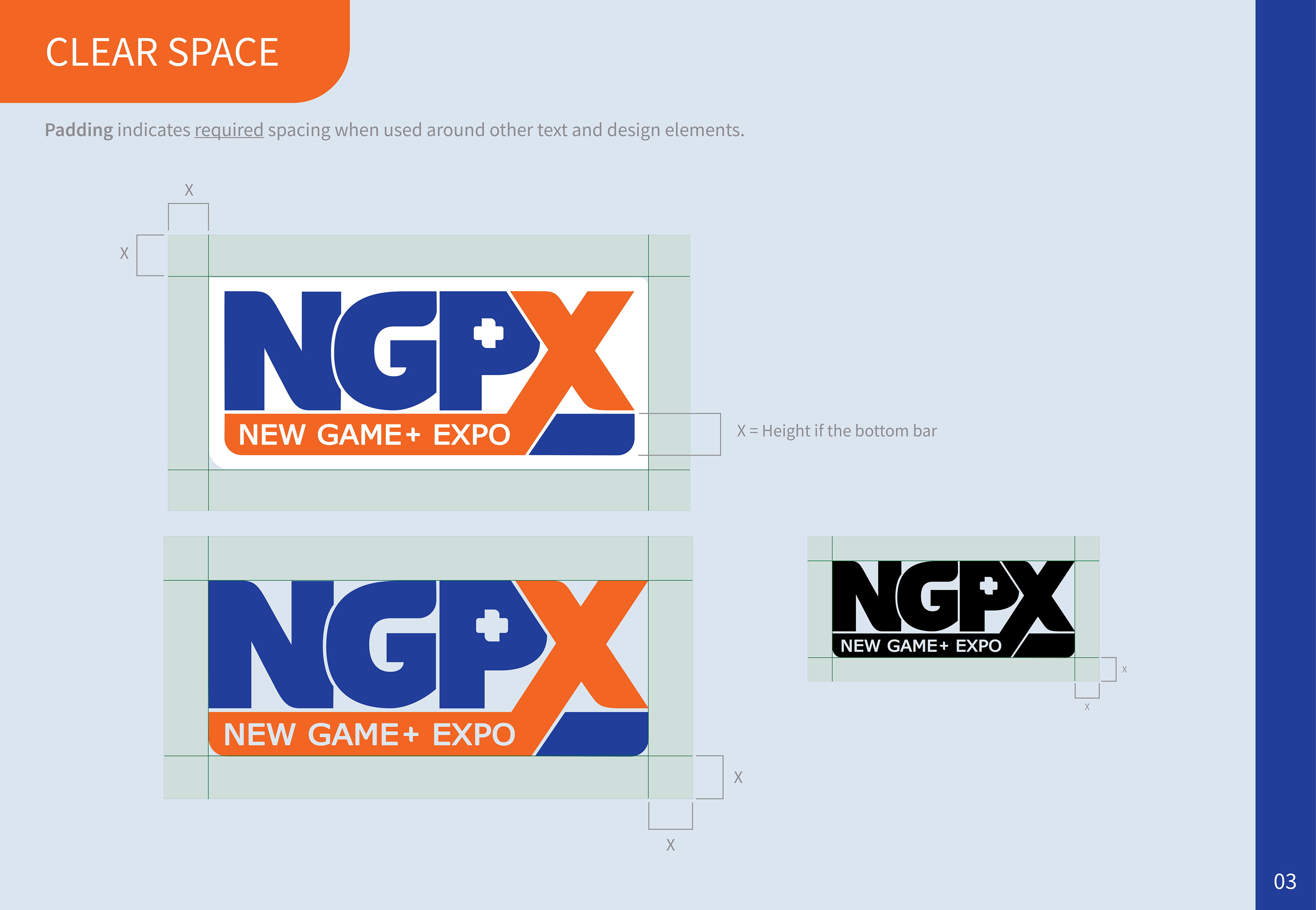
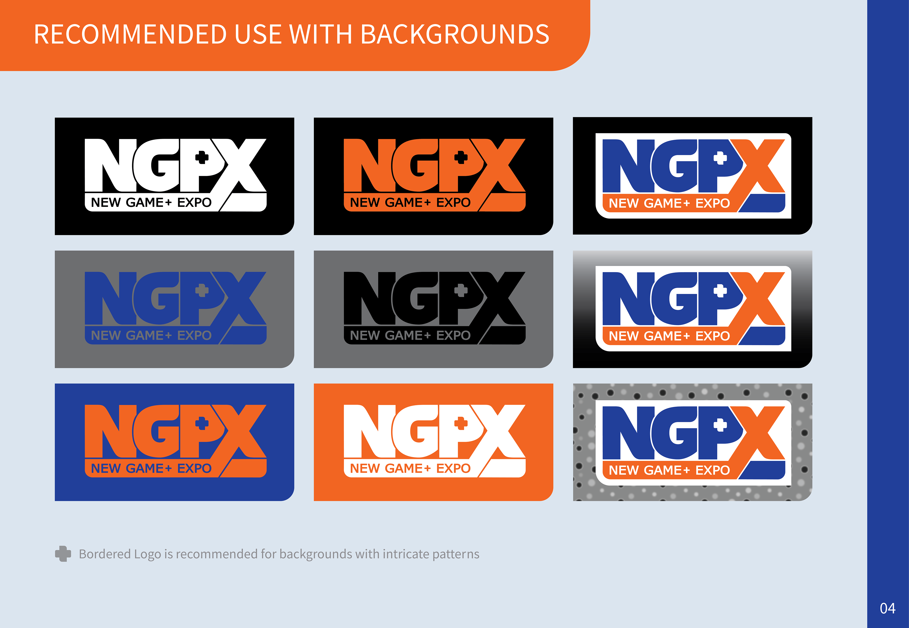
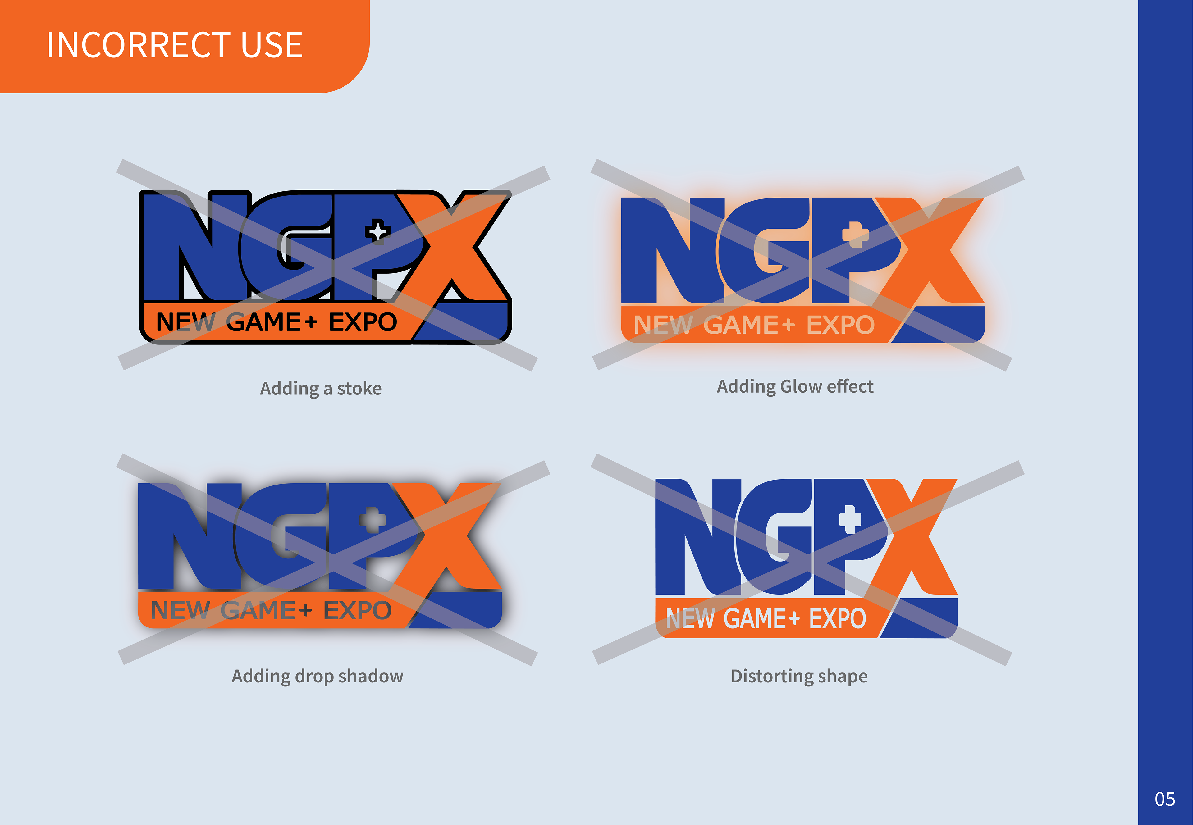
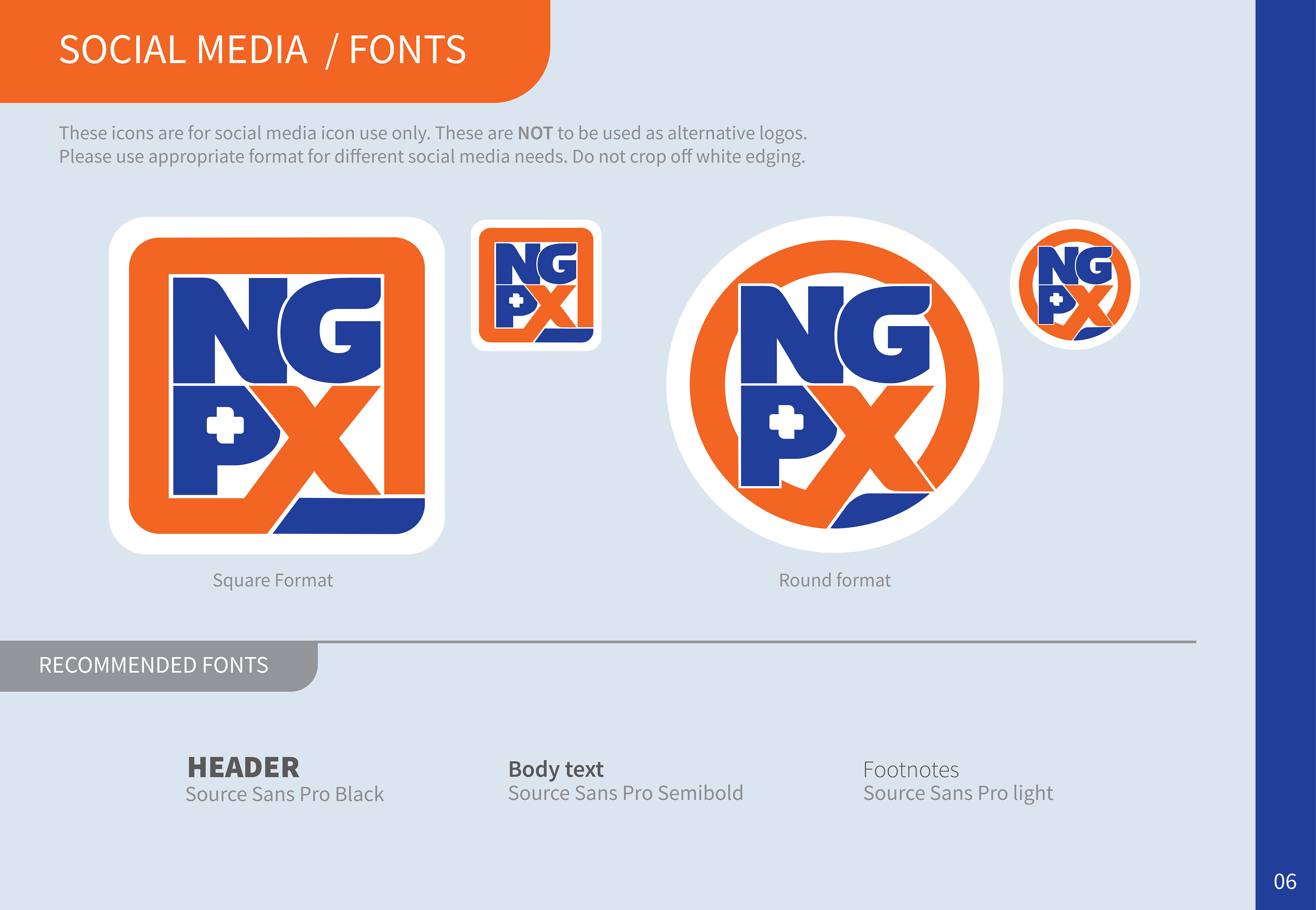
As Marketing and Events Manager, I led the creative development and rollout of the NGPX (New Game+ Expo) brand identity during the COVID era, coordinating cross-department collaboration and art directing the final logo and visual system alongside designer Chelsea Beaubien. I oversaw the creation of the official style guide and partner-facing brand assets used by participating publishers, then expanded the system into social templates, promotional graphics, and event communication materials that supported the launch and multi-year growth of the digital showcase.

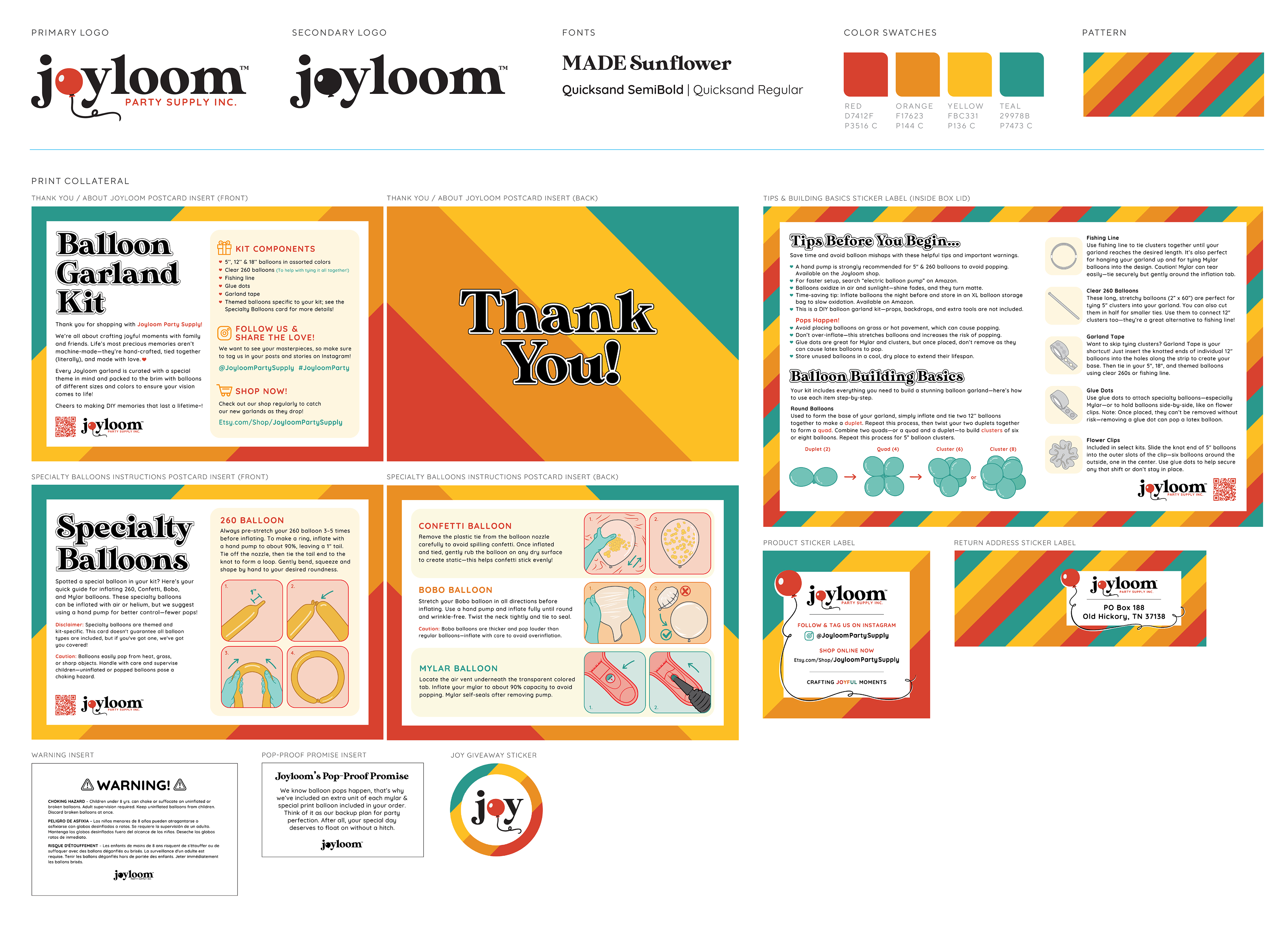
Joyloom Party Supply Inc.
Original Logo & Brand Styleguide
Joyloom was developed collaboratively with my business partner and investor, with the goal of creating a playful, approachable, and gender-neutral brand identity that would resonate with millennial parents while still feeling polished and professional. I helped shape the company’s naming, visual direction, and branding system, combining the concepts of “joy” and “loom” to represent weaving joyful moments together, while incorporating a red balloon motif into the logo to create an instantly recognizable connection to the party and event space.

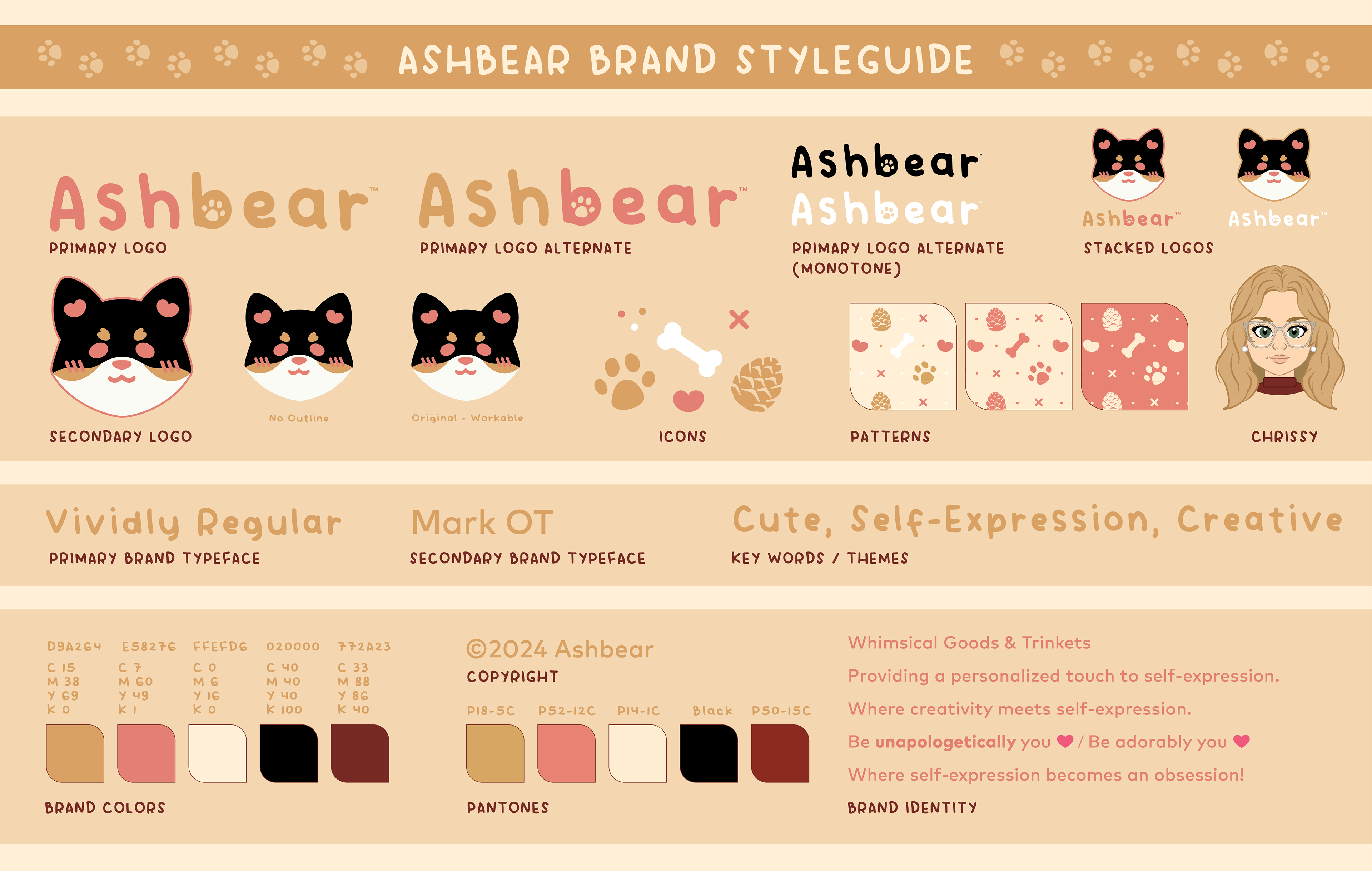
Ashbear
Original Logo & Brand Styleguide
Ashbear was a personal passion project that gave me the opportunity to build a brand entirely from scratch and express my own creative voice. The name was inspired by my Shiba Inu, Ash, who we affectionately call “Mr. Bear” and “Ashington Bear,” which naturally evolved into Ashbear. I created both a mascot logo based on Ash’s face and a custom wordmark to give the brand a playful, recognizable identity. Designing for Ashbear was especially meaningful because it combined my love of merchandise, self-expression, and entrepreneurship, eventually leading to pop-up events where I could share the brand in person.

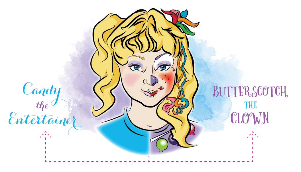
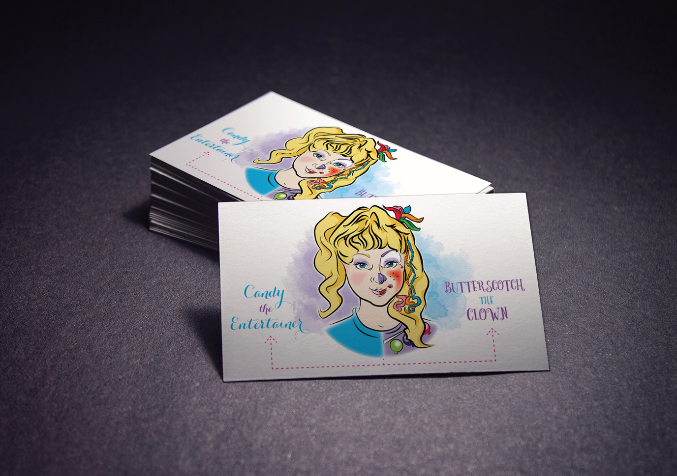
Candy the Entertainer & Butterscotch the Clown
This logo was created for my mother, a children’s entertainer and professional clown, who wanted branding that reflected both her established clown persona, “Butterscotch,” and a more personal entertainer identity, “Candy.” I designed a split-concept logo that visually merges both personas into one cohesive mark, allowing her to promote either direction under a unified brand. The illustrated portrait was custom vector-built in Adobe Illustrator, showcasing my ability to create clean, expressive character-based artwork for real-world branding applications.